

When you’re planning a kitchen tiling project, choosing the right tiles might seem like the biggest decision. However, there’s another element that has a huge visual impact: grout colour. Often overlooked, grout plays a crucial role in the style, maintenance, and overall feel of a kitchen. From helping the tiles pop, to creating a seamless backdrop, the grout colour you choose can completely change the overall impression of a room; as last year’s most popular kitchen tiles trends showcase.
In this blog, we’ll explore the essentials of choosing the right grout colour for your kitchen tiles, how grout affects the appearance of different tile types, and which grout colour best suits your kitchen style and maintenance needs. As the Midlands’ award-winning tile specialists, at EMC Tiles, we offer our customers expert advice and a wide range of tile and grout combinations to help bring your vision to life.
Why Grout Colour Matters in Kitchen Design
Grout might be small in scale, but its visual impact is anything but. The grout colour you choose influences how your tiles look, and how your overall kitchen space feels. Your grout choice:
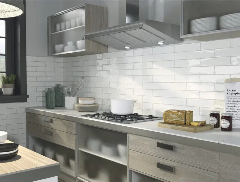
- Defines Tile Patterns: A contrasting grout colour makes tile shapes pop, while a matching grout colour blends the lines for a more seamless look, such as these stylish rustic Artisan Brick Effect Tiles by Equipe.
- Changes the Feel of a Room: Lighter grout colours can make your kitchen feel open and airy, while darker shades create depth and richness.
- Impacts Tile Size and Layout: The visibility of grout lines can make tiles appear larger or smaller, which affects the perceived scale of your space. Large format porcelain tiles or slabs are a popular kitchen design trend for creating that seamless look.
- Affects Maintenance: Lighter grout may show stains and discolouration sooner, whereas darker grout hides everyday dirt better.
- Completes the Style Story: Whether you’re going for sleek and modern, or rustic and traditional, your tile grout colour should enhance your overall kitchen aesthetic. Take a look at these trending kitchen splashback ideas for more inspiration.
Matching vs Contrasting Grout: Which Should You Choose?
The biggest decision in your grout colour kitchen planning comes down to whether you want your grout to blend in or stand out. Each approach has its benefits and style implications.
1. Matching Grout (Tone-on-Tone)
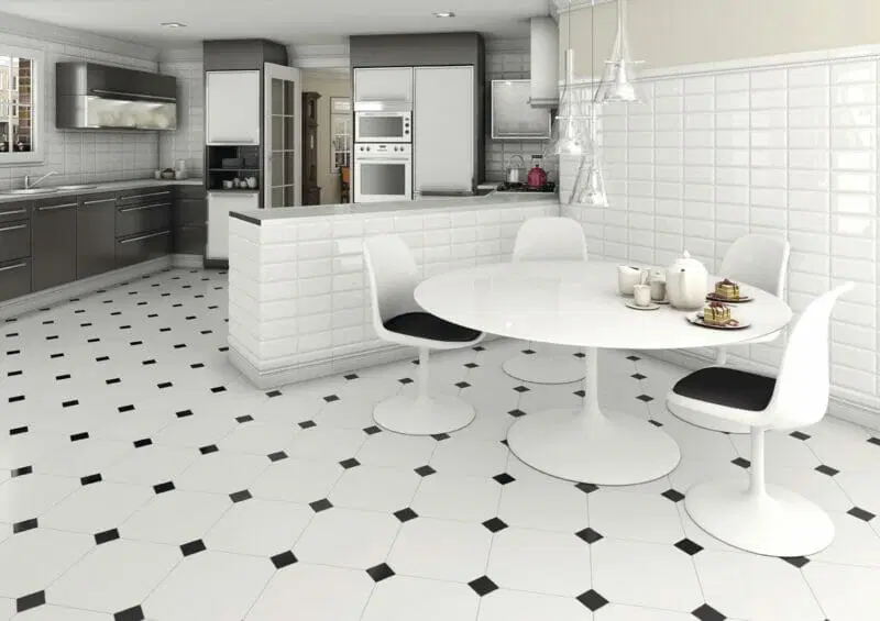
A matching grout colour is one that closely resembles the colour of your tiles. This creates a subtle, cohesive look with minimal visual interruption, and makes tiles appear larger and patterns more subtle. Just take a look at these elegant Alaska White Octagon Matt Ceramic tiles by Vives.
Best for:
- Modern or minimalist kitchen styles
- Small kitchens where continuity helps create the illusion of space
- Large format tiles or slab-look installations
Popular combinations:
- White tiles with white or light grey grout
- Grey tiles with matching grey grout
- Beige or sand-coloured tiles with similar grout tones
Pros:
- Clean, uncluttered finish
- Visually expands the space
- Less likely to highlight slight tile placement inconsistencies
Cons:
- Can lack definition and depth
- Light grout can stain more easily and show wear over time
2. Contrasting Grout
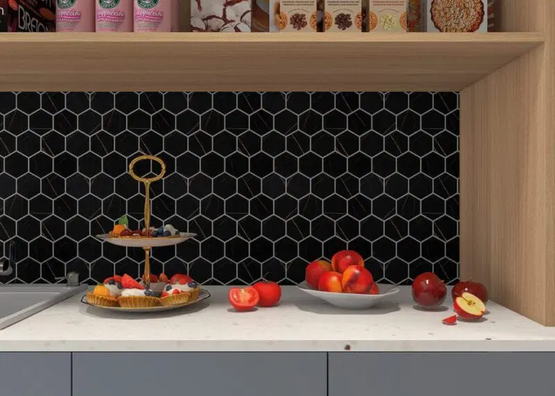
A contrasting grout colour creates a clear distinction between each tile, emphasising pattern and layout. This adds drama, texture, and visual interest, which draws attention to tile shapes. Just take a look at these stunning Silk Hexa Zero Black Glass Hexagon Mosaics by Intermatex.
Best for:
- Feature walls or splashbacks
- Traditional, industrial, or retro kitchen styles
- Small format or metro tiles
Popular combinations:
- White tiles with dark grey or charcoal grout
- Black tiles with white grout
- Coloured tiles with light or neutral grout
Pros:
- Defines tile shapes and layout
- Hides everyday grime and stains better than white
- Great for creative or vintage-inspired kitchens
Cons:
- Highlights grout lines, which can reveal installation imperfections
- May make small kitchens feel busier or more enclosed
Popular Grout Colour Combinations for Kitchen Tiles
When it comes to choosing grout colour for your kitchen, it’s not just about matching or contrasting – it’s about creating the perfect combination that suits your tiles, your space, and your style. Different tile colours and finishes can dramatically shift depending on the grout they’re paired with. Whether you’re working with crisp white metro tiles, elegant grey slabs, playful patterns, or rustic wood-effect planks, the grout colour you choose can make all the difference.
Here, we break down some of the most popular and practical grout colour kitchen combinations to help you achieve a look that is both stylish and easy to maintain.
For White Kitchen Tiles:
- White Grout: Classic, seamless, and modern – but it can be more high-maintenance
- Light Grey Grout: A practical alternative to white; still clean but hides dirt better
- Charcoal/dark Grey Grout: High contrast, great for industrial or modern style kitchens
Best grout colour for white tiles? Light grey is often the most balanced and low-maintenance choice.
For Grey Kitchen Tiles:
- Matching Grey Grout: Subtle and sophisticated
- White Grout: Brightens the space with contrast
- Dark Grey Grout: Adds depth and hides stains
Top Tip: Match grout to tile tone for a seamless finish.
For Patterned or Coloured Tiles:
- Neutral Grout: Let the pattern shine without competing
- Matching Grout: Keeps the look subtle and cohesive
- Contrasting Grout: Makes a bold, design-led statement
Top Tip: Always test grout samples alongside patterned tiles to see how the colour interacts with the design.
For Wood-Effect Tiles:
- Brown or Tan Grout: Creates a seamless, natural timber effect
- Grey Grout: Adds a contemporary twist to the rustic look
Top Tip: Choose a grout that mimics natural wood tones for realism.
How Grout Colour Affects Your Kitchen’s Overall Look
Your choice of tile grout colour doesn’t just affect the tiles; it shapes how your entire kitchen feels.
For example:
- Light Grout: Opens up a room, makes it feel bright and spacious; works well with white or pastel tiles for a sleek appearance
- Dark Grout: Adds depth and drama; pairs beautifully with light tiles for a high-contrast effect
- Matching Grout: Creates flow and cohesion; best for modern and minimalist styles
- Contrasting Grout: Highlights detail and draws the eye to tile layout and patterns
The width of your grout lines also plays a role. Wider joints increase the visibility of grout colour, while thinner grout lines give a sleeker, more subtle look.
Common Grout Colour Mistakes to Avoid
Even the most beautiful tiles can be let down by the wrong grout choice. From skipping samples to choosing shades that are hard to maintain, it’s easy to make small decisions that have a big impact on your finished kitchen.
Here are some of the most common tile grout colour mistakes to watch out for, and how to avoid them.
1. Not Testing Grout Samples First
Grout colour can appear dramatically different once dried and installed. Always sample grout with your chosen tile in your actual kitchen lighting.
2. Choosing Pure White Grout for Busy Kitchens
White grout looks sharp but shows stains, grease, moisture and discolouration quickly. Consider light grey instead for a more forgiving finish.
3. Ignoring Grout Line Width
Wider grout lines highlight grout colour more. If you’re going for a bold contrast, that’s great – but it needs to be a conscious choice.
4. Not Factoring in Long-Term Maintenance
Darker grout may hide dirt but can fade over time. Lighter grout needs more upkeep but looks clean and fresh when maintained.
5. Matching Grout to Worktops Instead of Tiles
Your grout colour should complement your tiles first – not the countertop. Your kitchen tiles are the dominant visual element.
6. Picking Trendy Colours That Don’t Last
Coloured grout can be fun, but bold hues may date quickly. Stick to neutral grout colours for that timeless look.
Practical Tips for Choosing Your Kitchen Tile Grout Colour
- Order grout samples and test them on your chosen tile
- View in both natural and artificial kitchen lighting
- Consider your kitchen style: modern, traditional, industrial?
- Think about your cleaning habits – are you okay with regular maintenance?
- Explore EMC’s kitchen tile collections for inspiration and ask the experts for advice
- Consider sealing light grout to prevent stains
- When in doubt: go slightly darker, not lighter – it’s more forgiving long-term
Grout Colour and Maintenance Considerations
Grout colour doesn’t just impact appearance; it also affects how your kitchen performs over time.
Here’s a quick overview:
- White and Cream Grout: Light, bright, but prone to staining; requires sealing and frequent cleaning
- Grey and Beige Grout: Mid-tones offer the best mix of style and practicality
- Dark Grout: Excellent for hiding grime, but may fade over time and show up soap residue
- Grout Sealing: Essential for light grout colours; recommended for easier cleaning
- Cleaning Tips: Use pH-neutral cleaners, and avoid harsh bleach on coloured grout
Achieve the Perfect Grout Colour with EMC Tiles
When it comes to choosing grout colour for your kitchen tiles, the options may seem endless – but armed with the right knowledge, it’s easy to make a confident decision. At EMC Tiles, our team is ready to help you find the perfect pairing for that striking design.
Visit one of our showrooms to see tile and grout combinations in person, or explore our kitchen tile ideas and curated tile collections in a range of colours and styles online.
With the right grout colour, you can enhance your space, elevate your design, and enjoy a kitchen that looks fresh and stylish for years to come.


