TSJ’s Editor, Joe Simpson, explores the best new tile ranges at Cersaie 2021; where maximalism and Mid Century Modern fought for attendees attention with Wabi Sabi, softer Industrial effects, and delicious reactive glazed wall tiles with great retro appeal.
Acyclical realignment of design trends, compounded by highly significant changes in tile production technology, has significantly changed the DNA of Cersaie – the world’s predominant tile show – in the past few years.
At Cersaie 2021, perhaps partly due to the fact that this was the first Bologna showcase for two years, this was particularly clear. It is fair to say that – back in the 1990s, 2000s, and 2010s – Cersaie had evolved into a floor tile show; with wall tiles taking a very secondary role.
This year’s show was something completely different: in effect, four tile shows in one. Bologna remains the premier catwalk for the latest floor tile fashions. Given Italy’s aesthetic lead in this market segment, that is hardly surprising.
But now, with the renaissance of interest in small formats, glaze heritage, pattern, shape, and relief, Cersaie was also a hotbed of exciting and exuberant wall tile designs. Utilising the latest moulds, geometric formats, reactive glazes, and inkjet decoration techniques – all spurred on by the adoption of 3D printing techniques to more fully explore surface relief and texture – wall tiles have undergone a dramatic reappraisal, and stylistic revival. This year, as well as the more obvious wall applications, Cersaie shone the spotlight on the creative application of tiles – feature walls, wetrooms, hotel bars, bedroom headboards, fireplace surrounds, hygiene-sensitive installations, sustainable architecture, community art projects, and more.
Return to tiling tradition
Many of the latest designs have sought inspiration in ceramic tile’s proud European heritage; delivering genuine authenticity by faithful reworkings and recreations of artisanal tiles from Italy, Spain, Portugal, Morocco, and beyond.
But Cersaie is now so much more than a tile show. Today it devotes a great deal of exhibition space to exterior tiling; 20mm or 30mm thick pieces that offer creative approaches to landscaping schemes. They offer up new commercial opportunities through potential partnerships with garden centres, local authorities, and landscape contractors; and, of course, a whole new set of likely consumers.
Cersaie 2021 also provided a valuable catch-up on the fast-developing slab market. Already making waves as worktops and furniture facings, these XXL pieces, starting at 1,000 by 3,000mm and growing ever larger, were display in Bologna as ceramic wallpaper, multi-tile feature walls, tunnel lining, murals, and much more.
Factor in technical applications, such as air-purifying and self-cleaning tiles, raised access floors, and ventilated and non-ventilated ceramic façades – maybe a fifth sub-sector in its own right – and you begin to appreciate the true complexity and diversity of Cersaie 2021; and that is before you experience the other materials – bathroom furniture, timber flooring, and sanitaryware – that share the newly-expanded exhibition space.
However, this article will only look at wall and floor tile trends. This will show that most current floor tile trends are refinements or variations on established design directions: mixed motif melanges, marbles, sandstone, terrazzo, concrete, wood, and hydraulic-effect patterns. If there were any real novelties, then they the first generation of multi-material melanges, such as wood with concrete, or marble with resin. The main take away, regarding floor tiles, was that little has really changed.
But even in this ‘steady as she goes’ mode, there were still some surprises in store. Firstly the cement-encaustic inspired hydraulic patterned tiles, including multi-design melanges, monotone mixes, and stronger three- and four-colour creations, are still very much centre stage.
Less predictably, the terrazzo trend is still strong, and still evolving. Cersaie saw examples of everything from monochrome micro-mix terrazzo effects, only one step removed from the salt and pepper tiles of yesterday, right through to brash and beautiful multi-colour stracciatella looks with über large inclusions of semi-precious stones, jewel-like mica flourishes, and bold single-colour base tones … and everything in between. These new wave terrazzo-effects were seen on floors, but also on walls, as bedroom headboards, feature walls, and splashbacks. They were also paired with less dramatic field tiles that picked up the dominant base colours of the terrazzo. Clearly, this remains a design direction that is well worth following.
Wood-effect tiles is another design family that has found a new lease of life. Cersaie saw many hexagonal timber tiles, alongside the more predictable chevrons, herringbone strips, and large plank formats.
Surface structure – such as simulated timber decking, routed wave forms, scrollwork decors, and routed detail – is bringing new depth of detail to wood-effect tiles, something emphasised by the latest matt finishes.
Design impact of Covid-19
Coronavirus has had a clear impact on design trends. Some are very predictable: such as the surge in interest in anti-bacterial and self-cleaning tiles. The global pandemic has rebalanced the cost-benefit analysis of these products, making them seem more commercially attractive.
Others pandemic impacts are less predictable, but equally tangible. One was the overarching upswing in home makeovers, interior design, and building finishes. Compelled to work from home, and unable to spend disposable income on dining out, holidays, and entertainment, discretionary spending has been channelled into the home.
The inside-out living trend has taken off: turbo-charged by soft new slip-resistant finishes that allowed the exact same tiles to be used internally and externally. For some tile companies, exterior grade tiles now represent up to a third of sales.
Unlike past global events, such as 9/11 or the 2008 economic crisis, the Coronavirus pandemic has not sparked a design retreat back to minimalism, neutral palettes, and ‘safe’ interior styling. In fact, the opposite seems to be true. The maximalism trend, already making waves prior to the outbreak of Covid-19, is now hugely influential.
In search of authenticity
At the same time another macro trend – the thirst for authenticity – has manifested itself in the tile arena in a resurgence of interest in small format tiles, bold colours, artisanal glaze effects, geometric shapes, 3D forms, and textured finishes. Digital inkjet printing is now being used in concert with sinking inks, reactive glazes, and 3D printing to push the boundaries of what is possible in tile design. And the results are spectacular and beautiful.
As a result – from cosy Autumnal tones and soothing blue-green shades, to the playful spirit of confetti-effect tiles and bold Art Deco patterns – 2020-22 wall tile design trends are all about tapping into emotions, and inspiring optimism.
Autumn is historically a season of transition, characterised by leaves starting to change colour. Many of the leading European tile manufacturers have taken a fresh look at the aesthetic impact of autumn, with patterns and colours that conjure the feeling of a crisp autumnal day. Organic hues – like earthy browns, golden yellows, and burgundy reds – are typical of the new wave of autumnal shades, often seen alongside tiles with a natural vibe, like wood or stone in a warm palette.
In contrast, Art Deco remains a timeless, classic, and popular trend. Characterised by bold geometric shapes and decadent details, today’s deco-inspired tiles feature chevron patterns, arches of contrasting marble, and scallop shapes full of colour.
Traditional deco style leans toward striking contrasts, juxtaposing dark and light. Others offer bold geometric shapes in monochrome palettes to create a powerful yet subdued statement. Seen in curved “fish-scale” hoops, and glitzy metallics, Jazz Age tiles are back with some panache.
Gloss tiles have also made a comeback, allowing floors and walls to pop with perfectly smooth surfaces and a beautiful shine. Gloss finishes are great for areas that need to be cleaned often – from splashbacks to lobby walls. In some collections, light and reflection are the main features, allowing designers to accentuate architectural features and construct chic environments full of drama. However, most tile lines offer a variety of finishes, ranging from dead matt to high gloss, which can be used side-by-side to create a perception of depth and eye-catching texture.
Beguiling blues and greens
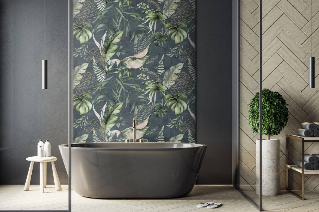
With blue and green dominating the colour arena this year – emerald is one of the go-to colours for today’s designers and classic blue was recently Pantone’s colour of the year – it was no surprise that this tertiary colour stands proud in many new tile ranges. At Cersaie it was outnumbered by greens, on everything from exuberant tropical leaf designs, through to dramatic rich marbles.
Colour trends reflect the overall emotions and mood of society and, according to colour theorists, blue-green combines the tranquil effects of blue with the optimistic feeling of green: much needed in these uncertain times. Hues of blue-green also have strong associations with water, from the turquoise of glacial lakes to the aquamarine of the Mediterranean.
Concrete, that ubiquitous building material that has facilitated creative architectural expression since ancient times, has been one of the main ceramic tile trends of the past decade. Long admired for its strength and beauty, concrete continues to serve as a muse for architects, as well as tile manufacturers. From the industrial look of Bréton brut, right through to the timeless charm of encaustic cement, concrete-effect tile collections can be used for all types of surface application, both indoors and out. The 2020 to 2022 period has seen fresh takes on the concrete-effect tile: from timber/concrete hybrids that reveal the impression of timber shuttering, to chalky effects closer to plaster, right through to luxurious polished plaster simulations. Overall, as seen in various spatulated looks, the results are more feminine, and more artisanal. In other words; bang on trend!
When Coverings, the big North American tile show, made its welcome return in April 2021, ten tile design trends stood out. It confirmed three of the macro-trends already covered here: gloss tiles, flecked-effects, and go-to greens.
Care-worn comforts
With the Wabi Sabi aesthetic leading to a growing preference for toned-down looks, tile options that offer a softer and more natural appearance have been heavily promoted.
If one trend really caught the eye at this year’s Cersaie it was the continuing evolution of the bolder marble effects. This was seen in richer colouration, gold and other metallic highlights and, in particular, in dramatic large-scale veining. Marble-look designs have clearly evolved; some showing fewer river-like veins with flowing movement and clean edges; while others sported more angular, frenetic looks.
Alongside the return to small format tiles, particularly wall tiles, at the other end of the spectrum extra-large ceramic tiles are still increasing in popularity this year-on-year. This trend enables countless applications and design possibilities, with large-format tiles in sizes up to 1,600 by 3,200mm, and thicknesses from 3.5mm to 20mm. The book-matched marbles are now available in multi-tile patterns, allowing complete walls to be created with continuous veining, or large repeat wallpaper effects. They are simply stunning.
Non-rectangular tile styles, specifically hexagons, have grown to monumental sizes, with 600mm diameter pieces, for instance, adding tons of drama to a space.
The influence of Mid Century Modern is also prevalent, in everything from concrete-look tiles with playful patterns, through to matt tiles in strong but muted tones that create soothing and relaxing spaces. Key colours include Olive Green, Dusky Pink, Cherry Red, Leather Brown, Charcoal Grey, Burnt Orange, Old Gold, and Cotton White. Throw in some enticing blue-green highlights, and season with a dash of opulent metallic glaze … and you’re pretty much there.
One of the easiest ways of changing the aesthetic appearance of any space is to add volumetric surfaces. Of course 3D tiles are not new in the tile industry, but many leading manufacturers – notably in Italy, Spain, and Portugal – have come up with ever more eclectic products – from sinuous waves and lines to deconstructed shapes and graphic representations of flora and fauna – to satisfy the market’s demand for novelty.
Thanks to their great versatility, the exciting new ceramic forms can be used to create all kinds of eye-catching reliefs from a classic bevelled small format to large-scale geometrics.
The prominence of pattern among the portfolios of many leading European tile manufacturers is somewhat of a surprise after so many years dominated by minimalism. European producers are adept at creating tile collections that allow for a variety of laying arrangements, facilitating innovative designs. Different effects can be achieved with multiple colours or just two or three. A pattern can fill an entire wall or just part of it. Some of the most successful combinations of tiles use a ‘less is more’ approach, mixing decors with plain field tiles, thus providing an intriguing focal point without overwhelming.
Majestic marbles
The UK has an on-going love affair with marble-effect tiles. Featuring shade variation and stunning detail, they can be the ultimate surface covering delivering visual impact for walls and floors with maximum wow factor, or they can blend into the background.
Two strong looks within tiles and interiors this year are Art Deco (as mentioned previously) and Japandi. Art Deco has all the grandeur and opulence you would expect, with geometrics, pattern and contrasting colour schemes, while Japandi is at the softer end of the design spectrum; full of modern neutrals for a more homely feel.
Bold marble-effects fit perfectly within the Art Deco trend. Strong marble-effects and directional veining is amplified through highly polished finishes and traditional black and white colour schemes. While the Art Deco trend is in favour, there will always be demand for tile designs in monochrome colour palettes with dramatic marbling.
What makes modern marble-effects so attractive is that they offer a sense of real luxury, providing a perfect setting for high end bathroom designs and living spaces, but at a fraction of the cost of the real material.
Softer limestone-effects are also in demand. The Japandi trend has seen homeowners and designers turn to calming limestone-effects to create a relaxing, tranquil environment. These demure limestone-effects feature discreet veining and modern neutral colour schemes that blend well with natural materials for a homely, lived in design scheme. Pale greys, warm beige, and off whites are all given visual interest through soft, gentle textures for surfaces that feel familiar and inviting.
These softer limestone-effects work well from floor to ceiling for a continuous look. Surfaces are kept uncluttered with hardware and accessories pared back to create open spaces without clutter.
Structured tiles remain popular for creating feature walls and zoning areas within a room, and often feature these soft marble or limestone-effects. Structured, raised surfaces are ideal for adding texture and interest to a room. The structure needs to be the stand out feature, not the actual printed effect, which is why designs feature neutral colour palettes and gentle marbling to allow the structure to do the talking.
Matt surfaces are stronger sellers, but we’ve also seen calacatta marble-effects with highly polished finishes become popular in more luxury designs.
Parkside’s predictions
Parkside, a specialist distributor for the specification sector, has identified two key themes for 2021/2022 in Nature’s Purity and Retro Pop.
Nature’s Purity explores the positivity of nature’s influence on interiors. As we seek a deeper connection to the natural world, it looks towards colours, surfaces and patterns that respond to this. Warmer, earthy ones are paired with natural materials that evoke a sense of purity and perfection.
Retro Pop sees a return to nostalgia, with the bold, geometric patterns of the 70s resurging, this time with a sunnier palette rooted in citrus yellow. Sweet pastels add energy and help to build playful spaces that encourage wellness, collaboration, connection and socialisation. Bringing fun and joy to workplaces and retail, Retro Pop sees ceramics, satin finishes and terrazzo clash for fun combinations that retain a feeling of positivity.
Judging from the displays at Cersaie 2021, Parkside’s predictions are very close to the mark. There were great examples of both themes at the show: and they promise well for the months ahead.
Other observations
One manufacturer to really catch the eye was Cerdomus. One of the technical themes running through this Italian factories stand was a softer, smoother R11 Safe finish, that will allow users to feature the same surface inside and out. Currently, the transition from internal to external tiling often involves a 20mm tile with a rougher surface. These are not only harder to keep clean, but also alter the look. With homeowners seeking seamless inside-out transitions, these new Soft surfaces should prove popular. For retailers they also mean fewer SKUs, and reduced inventory. Win, win!
The emergence of the 400 by 600mm format for stone-effect tiles (several leading factories were offering this) makes sense as this is a popular size in natural stone sector.
In wall tiles, one of the over-arching themes was small rectangles: 50 by 150mm, 100 by 400mm, 80 by 310mm, 63 by 250mm, 57 by 232mm, and onwards. This shape works equally well with whites, neutrals, pastels, or bold colours. In Bologna, these slim rectangles were shown with matt, satin, or gloss glazes – plus combinations of the three. The chalky matt glazes proved to be a good pairing with the Mid Century Modern palette, but also rocked washed-out neutral, and bright accent colours destined for splashbacks and feature niches.
Cersaie saw these small rectangles with smooth or bumpy faces; coated with flat or reactive glazes. They were displayed in horizontal, vertical, and herringbone laying patterns. Some of the very best options were shown by Tonalite, Recer, and Monopole, with 75 by 300mm tiles leading the way.
White on white
Cersaie featured a lot of wonderful white tiles with a just a hint of colour adding depth (Cotton White) with matt, satin, and gloss finishes. Many factories added in some 3D sculpting, or sinuous surface textures, to add relief and visual variety.
From gold and silver veins in marbles, through to large corten steel sheets, metallics are bubbling under. Look out for Zinc, and new silver, red, and blue metallic glaze effects on both wall and floor tiles.
Cersaie 2021 was the show when exact matching of pattern and texture really arrived in the wood-effect tile sector. Embossed-in-register patterns, where the dark inks accurately pick out knots and grains, featured on many stands. Cersaie 2021 also saw decking-style 3D surfaces, routed looks, bold hexagonal designs and wood-effect tiles specifically created for wall applications (feature walls, bedroom headboards, hallway panelling, etc). Keraben led the way in this area.
One clear trend was matt finish small format plain wall and floor tiles (200 by 200mm, 100 by 100mm, 100 by 200mm, etc) featuring an almost chalky finish reminiscent of Moroccan cement encaustic tiles. These deep plain tones, many inspired by the Mid Century Modern vibe, are starting to set the interior design agenda.
Overall, Cersaie 2021 confirmed that ceramic tiles are enjoying a period of unprecedented creativity, where the proven technical benefits of ceramic and porcelain tiles are now married to a rich and varied portfolio of mesmerising designs. The supreme surface is here!


